Choosing the perfect paint color for your home is more than just picking a shade you like; it’s an art form. The right interior paint colors can elevate your space, complement your furniture, and reflect your personal style. But how do you go about selecting the ideal hue that harmonizes with your existing decor? In this blog post, we’ll delve into the art of color matching, offering tips and insights to help you make an informed decision.
Understanding the Color Wheel: The Foundation of Color Matching
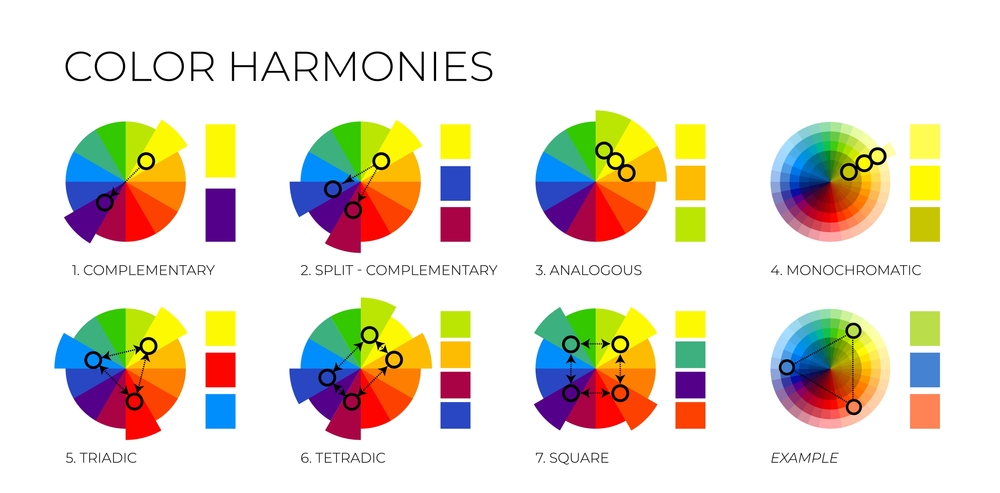
The color wheel is your best friend when it comes to color matching. Comprising primary, secondary, and tertiary colors, the wheel serves as a visual guide for combining colors harmoniously. But what does this mean in practical terms?
- Complementary Colors: These are colors that sit opposite each other on the color wheel. When used together, they create a vibrant and energetic look.
- Analogous Colors: These are colors that sit next to each other on the wheel. They offer a more subdued and harmonious feel.
- Triadic Colors: This involves using three colors that are evenly spaced around the color wheel, offering a balanced yet vibrant look.
Question to Consider: How can the color wheel help you in selecting paints that complement your existing decor?
The Role of Lighting: Natural vs. Artificial
Lighting plays a crucial role in how a color appears in a space. Natural light tends to make colors appear brighter, while artificial light can either warm up or cool down a color. Before making your final decision, it’s essential to observe how your chosen paint color looks at different times of the day and under various lighting conditions.
Question to Consider: Have you considered how different lighting conditions affect your color choices?
Texture and Finish: The Unsung Heroes
While the focus is often on finding the perfect shade, the texture and finish of the paint are the unsung heroes that significantly contribute to the overall look and feel of a space. Whether you opt for a matte, satin, or gloss finish, each has its unique characteristics that can impact how a color is perceived. So, what type of paint finish would best suit your decor and why?
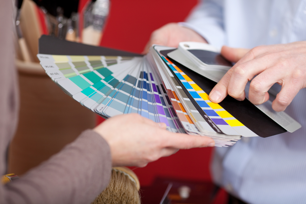
As you ponder this, don’t overlook practical aspects of color selection. Always test your choices with sample swatches on your walls to see how they interact with your home’s lighting and existing decor. It’s also wise to consult professionals, such as an interior painter, who can offer invaluable insights into color combinations and finishes.
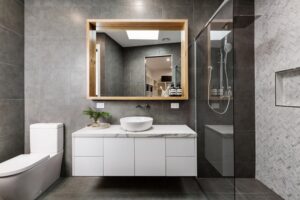
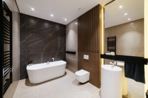
Lastly, always consider your existing furniture and decor when making your final color choice. By taking a holistic approach that includes both color and finish, as well as practical considerations, you’re more likely to achieve a harmonious and aesthetically pleasing result.
Conclusion
The art of color matching is a nuanced process that involves understanding the color wheel, considering the lighting conditions, and paying attention to texture and finish. By taking a strategic approach, you can select a paint color that not only complements your decor but also elevates your entire living space.
If you’re inspired by the possibilities of color matching and are considering a home makeover, look no further than Pro Quality Contracting. Specializing in stunning bathroom remodels and interior painting, our team is committed to delivering impeccable craftsmanship and attention to detail in every project. Why settle for less when you can transform your living space into a masterpiece? Take the next step in your home improvement journey by contacting Pro Quality Contracting for professional guidance and exceptional results.